Anabel Analysis of binding events - Version 2.2.3

Quick Guide
If you already know how to analyse binding curves, got to the quick guide section. Learn how to use Anabel within 10 min. Have fun!
The method which suits you best
You do not know which method is best for analysing your binding experiment? Follow the link, answer a few quetions and get advice on which method you could use.
Use Anabel offline
Do you prefer to run Anabel offline on your computer? The benefits are: No full server, no need to upload your data over the internet, much faster calculation times. Follow the link for more information.

Questions?
Do you have any questions? Go to our frequently asked questions section or just contact us if you cannot find a suitable answer to your problem. Be aware that we cannot answer all questions.

Publication
Did you use this software for your scientific work? Please have a look at our paper and do not forget to cite us:
Anabel Paper
Quick Guide
Anabel (Analysis of binding events) is a software designed for the analysis of binding curves with which to evaluate the interactions of biomolecules. Currently, Anabel supports exported kinetic datasets from Biacore, BLI, Score and an open data format. Furthermore, Anabel will help you to fit a model to your kinetic data and will calculate all kinetic constants. These include the observed binding constant (kobs), the association rate constant (kass), the dissociation rate constant (kdiss) as well as the equilibrium dissociation constant (KD).
Analysis mode
At the moment, Anabel offers the following two methods for calculating all kinetic constants:
Evaluation Method 1: kobs Linearisation
The kobs linearisation method can be applied if several association binding curves are available which have been measured with different analyte concentrations. A dissociation is not needed for this type of analysis. All rate constants as well as the equilibrium dissociation constant are solemnly calculated from the measurement of different kobs values. Therefore, the same experiment needs to be performed multiple times with varying concentrations of analyte in solution. At least three binding curves with different analyte concentrations are needed. However, we recommend to use five or more concentrations. Click here to read more about the evaluation method 1.
Evaluation Method 2: Single Curve Analysis
The single curve analysis method can be applied for a single binding curve if both a good association and a good dissociation region can be observed. However, if one of these regions does not show a clear exponential trend, the results will be statistically weak. After fitting the mathematical model to both sides of the same curve, the equilibrium dissociation constant can be determined. It is mandatory to say that the advantage of needing one experiment only results in a higher variation of the KD value. We recommend to always perform a reasonable amount of replicates. Click here to read more about the evaluation method 2.
Data support
Exported data from the following programs, methods or companies are supported in Anabel:
- Biacore (add “biacore” to the filename). Exported biacore datasets are .txt files.
- Octet (add “octet” to the filename). Please use the complete exported raw data file and not the sensor position files for upload. Typically, raw data files are .xls files.
- Biametrics (add “biametrics” to the filename). The data format needs to be a .xls or .xlsx file.
It is important to add the datatype name somewhere in the file name so that Anabel can assign the files correctly. For example: If you have an exported biacore dataset file with the name “experiment.txt”, then you will have to alter its name to something like “experiment_biacore.txt” or “biacore_experiment.txt”. Thereafter, you can upload the file and analyse it in Anabel.
Furthermore, it is also possible to upload any other data in an Anabel-compatible format. Simply use our provided excel file or bring your data to the following format:
| x-values | y-value A | y-value B | y-value C |
|---|---|---|---|
| 1 | 1.005 | 2 | 4.5 |
| 2.45 | 1.007 | 3 | 5.7 |
Using this format, an unlimited number of y-values can be assigned to one common x-axis. Save the file as .xlsx or .xls and upload them to your method of choice. Click here in order to download our excel template file.
Alternatively, you can also use an alternating x- and y- axes data format like this:
| x-values A | y-value A | x-value B | y-value B |
|---|---|---|---|
| 1 | 1.005 | 1 | 4.5 |
| 2 | 1.007 | 2 | 5.7 |
Save the table as a tab-delimited .txt file and add the name “biacore” to your filename. Otherwise, this alternating x- y-value pattern will not be recognised by Anabel.
Quick Guide Evaluation Method 1: kobs Linearisation
- Upload data
- Perform a curve manipulation (e.g. drift correction) if necessary
- Zoom into the area of interest by drawing a frame in the overview graph
- Draw another frame in the zoomed graph to perform a fit
- Optimise your selected fitting region by having a look at the curve analysis graphs
- Click “Save Results” in order to save the current fits
- Repeat as often as needed or upload new dataset with different experiment conditions (e.g. different analyte concentrations).
- If all necessary fits have been performed, go ahead and edit the “All Saved Fit Results” data frame by providing the spot names, comments and most importantly the reagent concentrations. Simply use the row ID number in order to edit the row.
- Either perform the kobs linearisation automatically by name (Anabel will treat all data points as one dataset if they have the same name) or manually by selecting the rows and choosing a common name.
- Thereafter, press “Save Fit” in order to yank the results. Repeat steps 9 and 10 as often as you like.
- After the evaluation is finished, click “Download Result File” in order to receive an excel file which contains all relevant results from all the datasets that have been used for the evaluation.
Quick Guide Evaluation Method 2: Single Curve Analysis
- Upload data
- Perform a curve manipulation (e.g. drift correction) if necessary
- Zoom into the area of interest by drawing a frame in the overview graph
- Draw another frame in the zoomed graph to perform a fit
- Optimise your selected fitting region by having a look at the curve analysis graphs
- If an association curve has been fitted, click on “Yank association fit”. If a dissociation curve has been fitted, click on “Yank dissociation fit”. Be careful to perform both the association fit and the dissociation fit for the same curves.
- Type the reagent concentration into “Reagent concentration” for the fitted curves. (All of them have had to be performed with the same concentration)
- Click on “Analyse yanked fit results” to save the results
- Repeat step 1 to 8 as often as needed.
- After the evaluation is finished, click “Download Result File” in order to receive an excel file which contains all relevant results from all the datasets that have been used for the evaluation.
Method Finder
So you are evaluating your data with Anabel? Congrats on that. You might wonder why there are two possible ways to evaluate your data and you don’t know which one gives you the best - or let's say - the most trustful results? Let us help you with that decision. Just answer the questions below.
First of all and most IMPORTANTLY: Have you checked your data file format?


Theoretical Background
In the following section we derive binding constants based on the assumption that a 1:1 binding occurs between a ligand L (on a surface) and an analyte A (in solution).
Determination of binding constants

The interaction of a ligand L with an analyte A, forming a ligand-analyte complex AL, can be described by the following chemical reaction [1]–[3]:

In this reaction, kass and kdiss are the rate constants for the association and dissociation of the analyte-ligand complex. A reaction with two molecules forming one complex is called a bimolecular reaction, whereas the disintegration of one complex into two molecules is a unimolecular reaction. The more AL complex is built, the higher are the concentrations of free molecules A and/or L and the higher is the rate constant of association kass (1). In contrast, the higher the concentration of the complex (AL) and the higher the rate constant of dissociation kdiss are, the more AL complex will decay into A and L (2). Therefore, the building rate of the analyte-ligand formation (d[AL]/dt) can be described by the following differential equation (3) [3]:
$$\frac{d[AL]}{dt}=k_{ass}\cdot{[A]}\cdot{[L]}$$ $$\frac{d([A]+[L])}{dt}=k_{diss}\cdot{[AL]}$$ $$\frac{d[AL]}{dt}=k_{ass}\cdot{[A]}\cdot{[L]}-k_{diss}\cdot{[AL]}$$In the equilibrium state, equation (3) will become zero and can be rearranged to form the law of mass action equation for our biomolecular reaction. Subsequently, the association constant (KA) and the dissociation constant (KD), which is the reciprocal of KA, [3] can be described as follows:
$$K_A=\frac{k_{ass}}{k_{diss}}=\frac{[AL]}{[A]\cdot{[L]}}=\frac{1}{K_D}$$However, this model is only valid for a homogeneous system in which both the ligand and the analyte are in solution, are not limited by any transport processes or steric hindrances and react in a 1:1 manner. When performing microarray experiments, a surface supporting the microarray is mandatory. This already creates a strong steric hindrance and limitation for the binding process. That fact has to be taken into account. Since the ligand molecule is immobilised on a surface and the analyte is flushed over this surface inside a microfluidic chamber (Figure 3), further assumptions have to be made. For such binding events on surfaces, the flow velocity close to the surface is assumed to be zero (no slip condition), thereby creating a thin diffusion layer above the immobilised ligand L [4]. Hence, an analyte A being flushed over the chip has to cross the diffusion zone via diffusion before binding to the ligand. This process is generally called mass transport. If the analyte binds so quickly to the ligand that its concentration directly on the surface is lower than in the bulk solution and depletion occurs, then the binding kinetic is mass transport-limited. In order to reveal the binding kinetics, the supply of analytes has to be vastely increased. This can be ensured by high flow rates and/or high concentrations of analyte [1], [2].

Apparently, the model for describing binding kinetics on surfaces becomes much more complicated. To simplify the equation, a linear concentration gradient is assumed inside the diffusion layer. With this simplification, the details of mass transport and other effects like molecular crowding or zeta-potentials are neglected for the purpose of solving the equation. Using the gradient assumption, the velocity of the analyte-ligand complex formation on a surface can be described as equation (5). Details about the mathematical background and how to derive the equations can be obtained from [1]–[3].
$$\frac{dΓ(t)}{dt}=k_{ass}\cdot{[A]}\cdot{(Γ_{max}-Γ(t))}-k_{diss}\cdot{Γ(t)}$$The previous ligand concentration is replaced by the surface load capacity (Γ(t)). It describes the amount of analyte-ligand complexes per surface area at a given time point t. Hence, Γmax refers to the maximum amount of complexes per surface area unit. Subsequently, equation (3) can be rearranged to:
$$\frac{dΓ(t)}{dt}=k_{ass}\cdot{[A]}\cdot{Γ_{max}}-(k_{ass}\cdot{[A]}+k_{diss})\cdot{Γ(t)}$$If the concentration of analyte [A] is kept constant during the experiment, this differential equation can be solved with the following function (mathematical derivation is shown in [1], [2]), which is refered to as binding model from here onward:
$$Γ(t)=Γ_{GG}-Γ_{GG}\cdot{e^{-k_{obs}\cdot{t}}}$$With
$$k_{obs}=k_{ass}\cdot{[A]}+k_{diss}$$ΓGG describes the equilibrium surface load capacity where Γ(t) approximates to a constant value over time. Moreover, kobs represents the observable binding rate constant. Furthermore, kobs is dependent on the concentration of analyte [A] and the rate constants for association kass and dissociation kdiss.
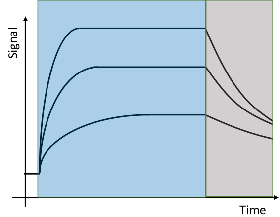
This derived mathematical model can now be used for the fitting of the association and dissociation binding signals (Figure 1). Thereby, an observable rate constant kobs can be calculated for every exponential curve. The kobs value generally describes the curvature. In case of an association curve fit, kobs includes both the association and the dissociation rate constant (6). However, in case of a dissociation curve fit, the analyte concentration is zero. Neglecting avidity and rebinding effects, the mathematical equation can be simplified to (9):
$$k_{obs}=k_{diss}$$There are two possible ways to calculate the binding rate constants kass and kdiss:
-
Evaluation Method 1: kobs Linearisation
The binding rate constants are solemnly calculated through the kobs values gained from association fits. According to equation (6), the rate constant kkobs linearly depends on [A]. In order to perform a linear fit, a minimum number of three kobs values with varying concentrations needs to be measured (five or more different concentrations are recommended). Thereafter, the different kobs values are simply plotted vs. the concentration [A]. The linear regression is calculated using equation (6) with the slope as kass and the y-axis intercept as kdiss. Using these rate constants, the KD value can be calculated (KD=kdiss/kass). Have a look at the Evaluation Method 1 section to gain a deeper understanding of this method and learn how to apply it in Anabel. -
Evaluation Method 2: Single Curve Analysis
The binding constants are calculated from a single binding curve by performing an association and a dissociation fit. As already indicated above, the kobs value gained from a dissociation curve equals the dissociation rate constant kdiss. By using kobs gained from the association curve fit, kass can be calculated according to equation (6). The KD value can be derived from the kass and kdiss values (KD=kdiss/kass). Have a look at the Evaluation Method 2 section to gain a deeper understanding of this method and learn how to apply it in Anabel.
Please feel free to make use of our Method Finder in order to decide which method is best for your data.
References
- K. Länge, “Application of flow injection analysis in label free binding assays.” Universität Tübingen, 2000.
- M. Reichert and G. Gauglitz, “Affinitätsreaktionen - Chemgapedia.” [Online]. Available: http://www.chemgapedia.de/vsengine/vlu/vsc/de/ch/13/vlu/kinetik/affinitaet/affinitaetsre aktionen.vlu.html. [Accessed: 19-Oct-2015].
- R. Karlsson, A. Michaelsson, and L. Mattsson, “Kinetic analysis of monoclonal antibody-antigen interactions with a new biosensor based analytical system,” J. Immunol. Methods, vol. 145, no. 1–2, pp. 229–240, Dec. 1991.
- J. Berthier and P. Silberzan, Microfluidics for Biotechnology. 2010.
Evaluation Method 1: kobs linearisation

Introduction
The kobs linearisation is one of Anabel’s methods to obtain all relevant binding constants. Based on the model and equations derived in the theoretical background, the kobs values of 1:1 binding events can be described by the following equation (10):
$$k_{obs}=k_{ass}\cdot{[A]}+k_{diss}$$Herein, the reagent concentration [A] refers to the concentration of free, dissolved analyte A, whilst the ligand L is immobilised on the surface. Please note: Anabel is only designed to investigate binding events in which one binding partner has been immobilised on a sensor surface (Figure 3; Theoretical Background) and the other stays in solution. This setup is typical for nearly any solid phase biosensor. The actual software version is only capable of analysing 1:1 reactions.
When using the kobs linearisation method, only the association region (Figure 4) will be used for fitting. A kobs value can be calculated for every association curve with help of the binding model. This will leave us with the two unknown variables kass and kdiss, as the analyte concentration is defined through the experimental setting. In order to calculate the desired constants (kass and kdiss) via kobs-linearisation, it is necessary to repeat the binding experiment with varying analyte concentrations. In other words: If you do not have datasets with at least three different reagent concentrations, you are not able to perform a kobs linearisation. In this case, the only analysis that might be possible is Evaluation Method 2: Single Curve Analysis. WARNING: Values obtained from one single curve are never as precise as values obtained from Evaluation Method 1.
Data preparation and upload
To perform a fit in Anabel, one has to prepare the data for upload first. Check our data support section to find out which datasets and -types are currently supported by Anabel.
Curve fitting:
After uploading the dataset, Anabel will start by generating an overview plot over the whole time range of the experiment. This time range can be altered using the slider below the overview graph. If the dataset shows a systematic drift, one might think of performing a single or dual drift correction. Go to the curve manipulation section to find out more on this topic. The overview graph is not sufficient to choose an exact fitting region. Therefore, one has to zoom into the association region by drawing a rectangle into the overview graph in order to generate the zoomed graph (Figure 5). It is recommended to extend this area slightly beyond the intended fitting region. Thereby, the later choice of the exact fitting region becomes much easier to make.

Thereafter, the fitting region can be selected within the zoomed graph (again by drawing a rectangle) (Figure 6). Make sure to only fit the association region when performing a kobs linearization. Furthermore, do not include data points before or after the association curve.

As an R based program, Anabel uses the following code (11) to perform the fit:
$$fm\lt-nls\,(\,y\sim{a}\cdot{exp}(-b\cdot{x})+c, \,start=list\,(\,a=a,b=b,c=c)) $$NLS (Non-linear least squares) is a R fitting routine to estimate the parameters of a non-linear model as described by equation (12).
$$f(t)=a\cdot{e^{-b\cdot{t}}}+c$$The nls function also needs initial values for the parameters a, b and c. The following exponential assumptions (13-15) can be used to calculate good approximations for these initial values:
$$f(0)=a+c\\ a=min\,(\,first\,three\,values\,)-c$$ $$\lim_{x\to\infty}f(t)=a\\ c=max\,(\,last\,three\,values\,)-\frac{1}{3}\cdot{a}$$ $$f(τ)=c+\frac{a}{e}\\ c+\frac{a}{e}=a\cdot{e^{-b\cdot{τ}}}+c\\ e^{-1}=e^{-b\cdot{τ}}\\ b=\frac{1}{τ}$$
As the number of values to calculate the initial values with is limited by the range of selected data points in the zoomed graph, f(0) is set to be the minimum of the first three chosen data values (13). Likewise, the maximum of the last three chosen data values is used for f(t→infinity) (14). With these assumptions, it is possible to estimate c (14) and a (13). Additionally, the c value is increased by one third of the distance “a” as the “real” maximum value of the asymptote is usually larger than the chosen maximum values, including their noise. Generally, this should increase the stability of the fit. The constant b is a bit more difficult to estimate (15). For this purpose, the characteristic time constant Γ is estimated. Γ represents the time at which the distance of the y-value and the constant c equals –a/e (Figure 7), the step response of the system. Therefore, this time point has a value of c+a/e (15). After solving the equation, b can be estimated as 1/Γ. As the value of a/e is approximately 0.4 (or 40%), Anabel simply looks up the time point that is closest to this 40%, which is (a+c) + 0.6*(-a) (Figure 7).Having estimated the initial parameters, the R nls function starts to refine the parameters a, b and c through an iterative least square process. Compared to the binding model (7) derived from the theoretical background section, all relevant constants are defined as follows (16-19):
$$f(t)=y_0+A_0\cdot{e^{-k_{obs}\cdot{t}}}$$ $$y_0=c$$ $$A_0=a$$ $$k_{obs}=b$$Additionally, all standard errors are calculated by the nls model routine. Anabel will visualise the resulting fit within the “fit” panel (Figure 8). The calculated parameters will show up in a table above the “save results” button. Furthermore, it is possible to refine the fit by changing the fitting region in the zoomed graph. Simply expand, reduce or shift the selection to automatically update all values. The selection of the “right” area for the association fit can be tricky. Moreover, it is the most difficult part of the whole data analysis and has the highest impact on the final results. In order to find the best fitting region, Anabel offers assisting analysis graphs, which analyse the chosen fitting region. They can help to decide if a fitting area should be reduced or expended. Read more about the assisting analysis graphs and how to perform the optimal fit in the assisting analysis graphs section.

Finally, if the fit is as good as possible, click on “save results” to save and yank the current fit. Its statistics will then appear in the “all saved fit results” table. Moreover, Anabel will yank the fit graph and the overview graph to finally generate the result file. In theory, the fitting procedure explained above can be repeated as often and with as many data points as needed. This also includes the upload of several different datasets.
Kobs linearisation:
In the last step of the kobs linearisation method, the actual kobs linearisation will be performed. As already indicated with equation (10), it is important to calculate multiple kobs values for the binding event using different reagent concentrations [A]. In other words: The binding experiment has to be performed multiple times over a well-defined range of reagent concentrations. Finding the perfect concentrations can be difficult. Ideally, they should range from 0.1 to 10-times of the KD value. However, as this value is not known beforehand we recommend to perform as many experiments as possible to cover a big range of concentrations. It is also reasonable to perform replicates for the same concentrations to improve statistics.
Inherently, Anabel does not know the reagent concentrations applied for the experiments. Thus, it is important to edit the “all saved fit results” table by assigning the analyte [A] concentrations to the calculated kobs values. Each row in the table has a unique identifier on its very left side. Use this row number in the form on the left side of the table to edit the corresponding row. It is necessary to provide a concentration for every kobs value that will be used for the later kobs linearisation. Additionally, it is possible to change the spot names and to add some commentary. If the form is filled in completely, click on “update table” to update the corresponding rows. It is also possible to edit several rows at once by separating the row ID numbers using a “,” (selecting them individually) or a “-“ (selecting a range of rows). After choosing the “-“ selector for the row IDs, it is either possible to apply the same information to all chosen rows or to apply multiple arguments by separating them with a comma. When using the “,”-selector for the row IDs, it is possible to individually apply the reagent concentrations, names or comments to the appropriate rows. Thereby, the order of the given arguments separated by “,” is important. If any mistake has been made in the form, nothing will happen when “update table” is clicked and Anabel will wait until everything is filled in correctly. In case of mistakes, it is always possible to edit the same table row multiple times.
Finally, Anabel offers two different ways to carry out the kobs linerisation. If the “automatically by name” option has been selected, Anabel will find all values with the same name and will plot their kobs values against their reagent concentrations. After selecting the “single” option, Anabel will use all values from the “all saved fit results table” which are highlighted in grey. The data frame rows can be highlighted by clicking on them. Subsequently, Anabel tries to find a common name for all the selected kobs values, which will appear in the “name” field. However, it is also possible to change this name into something more reasonable. Either way, Anabel will use the selected data points to perform a linear fit according to the following R command (20) and its mathematical equation (21):
$$fit=glm\,(\,y\sim{x}\,)$$ $$f(x)=mx+b$$The glm (generalised linear model) function is an R routine for the calculation of all parameters of a linear fit and their corresponding standard errors. Compared to equation (10) and figure 9 B, the calculated slope (m) is equal to the association rate constant (kass), whereas the y-axis intercept equals the dissociation rate constant (kdiss). Attention: A linear fit only appears after a selection of three or more data points. The binding constant KD (22) and its standard error (23) can easily be calculated using the following equations:
$$K_D=\frac{k_{diss}}{k_{ass}}$$ $$s_{k_D}=K_D\cdot\sqrt{\frac{s_{k_{diss}}^2}{k_{diss}^2}\cdot\frac{s_{k_{ass}}^2}{k_{ass}^2}}$$
In the final step, click on “save fit” in order to yank the linear fit results. Subsequently, all relevant binding constants will appear in a small table underneath the “save fit” button. If more data points have been analysed, the results will of course add up to the already existing ones.
Result file
Finally, the kobs linearisation is completed by downloading the result file. First, click on the button "Generate Result File" to generate the file. A progress bar will pop up to show the status of the calculation. Thereafter, the file can be downloaded by clicking on the “Download Result File” button. The result file itself is an excel file consisting of the following sheets:
- “summary” sheet: Contains all overview graphs of all uploaded datasets. It serves as an overview of the datasets used for the analysis.
- “fits” sheet: All fits performed throughout the analysis can be found here with their corresponding number. Furthermore, all analysis graphs (if activated) can be found to the right side of the fits. Additionally, the region in which the fit was performed can be found underneath the fitting graph, together with the corresponding overview graph. The overview graph itself was saved with a higher resolution and can simply be enlarged.
- “all_fit_results” sheet: Contains all fit results from the “fit” sheet in one table. Additionally, the table contains all the information that has been inserted afterwards in the “all saved fit results” table, like the reagent concentration (c(Reagent)) or the changed spot names. Moreover, the summary offers the colums “row_ID” and “fit_ID”. The “row_ID” refers to the same row ID known from the “all saved fit results” table. The fit_ID shows the fit number to which the data belongs.
- “all_kobs_fits” sheet: Contains all plots as well results of the actual kobs linearisation. Moreover, the data used for the plot can be found under the results table. In “row_ID” and “fit_ID” it is well documented which datapoints and fit results were used for the linearisation.
- “all_binding_constants” sheet: Contains a simple collection of all linearisation results. This can make it easier for the user to perform further analyses with the calculated values.
Evaluation Method 2: Single Curve Analysis

Introduction
The single curve analysis is Anabel’s second method to obtain all relevant binding kinetic constants. Compared to Evaluation Method 1, the binding model is not only fitted to the association curve but also to the dissociation curve. However, the following equation (24) is true for both Anabel methods:
$$k_{obs}=k_{ass}\cdot{[A]}+k_{diss}$$Herein, the reagent concentration [A] refers to the concentration of free, dissolved analyte A which can bind to the immobilised ligand L. Please note: Anabel is only designed to investigate binding events where one binding partner has been immobilised on a sensor surface (Figure 3; Theoretical Background), whereas the other binding partner stays in solution. This setup is typical for nearly any solid phase biosensor. The current software version is capable of analysing 1:1 reactions. As Anabel is an open source program published on githup, everyone can alter the equations in order to analyse different binding kinetics.
Using the single curve analysis method, it is possible to calculate both rate constants (kass and kdiss) through the analysis of a single binding curve. The fit to the dissociation curve will reveal a kobs value that equals the dissociation constant kdiss as the analyte concentration is thought to be zero (24). Together with the kobs value obtained from the fit to the association curve, the kass constant can be calculated. We will come back to these equations later in more detail. In general, a single curve analysis can only be performed if good on- and off-kinetics are visible in the data. WARNING: Values obtained from a single curve analysis are never as precise and statistically significant as values obtained from the Evaluation Method 1.
Data preparation and upload:
To perform a fit in Anabel, one has to prepare the data for upload first. Check our data support section to find out which datasets and –types are currently supported by Anabel.
Curve fitting
After uploading the dataset, Anabel will start by generating an overview plot over the whole time range of the experiment. This time range can be altered using the slider below the overview graph. However, the overview graph alone is not well suited to choose an exact fitting region. Therefore, one has to zoom into the association or dissociation region by drawing a rectangle into the overview graph in order to generate the zoomed graph (Figure 11). It is recommended to extend this area slightly beyond the intended fitting region. Thus, the later choice of the exact fitting region becomes much easier.

Thereafter, the fitting region can be selected within the zoomed graph (again by drawing a rectangle) (Figure 12). Make sure not to include data points before or after the association or dissociation curve respectively.

As Anabel is an R based program, it uses the following code (25) to perform the fit:
$$fm\lt-nls\,(\,y\sim{a}\cdot{exp}(-b\cdot{x})+c, \,start=list\,(\,a=a,b=b,c=c)) $$NLS (Non-linear least squares) is an R fitting routine to estimate the parameters of a non-linear model as described by equation (26).
$$f(t)=a\cdot{e^{-b\cdot{t}}}+c$$The nls function also needs initial values for the parameters a, b and c. The following exponential assumptions (27-29) can be used to calculate good approximations for these initial values:
$$f(0)=a+c\\ a=min\,(\,first\,three\,values\,)-c$$ $$\lim_{x\to\infty}f(t)=a\\ c=max\,(\,last\,three\,values\,)-\frac{1}{3}\cdot{a}$$ $$f(τ)=c+\frac{a}{e}\\ c+\frac{a}{e}=a\cdot{e^{-b\cdot{τ}}}+c\\ e^{-1}=e^{-b\cdot{τ}}\\ b=\frac{1}{τ}$$
As the number of values to calculate the initial constants with is limited by the range of selected data points in the zoomed plot, f(0) is set to be the minimum of the first three chosen data values (27). Likewise, the maximum of the last three chosen data values is used for f(t→infinity) (28). With these assumptions, it is possible to estimate c (28) and a (27). Additionally, the c value is increased by one third of the distance “a” as the “real” maximum value of the asymptote is usually larger than the chosen maximum values, including their noise. Generally, this should increase the stability of the fit. The constant b is a bit more difficult to estimate (29). For this purpose, the characteristic time constant τ is estimated. τ represents the time at which the distance between the y-value and the constant c equals –a/e (Figure 13), the step response of the system. Therefore, this time point has a value of c+a/e (29). After solving the equation, b can be estimated as 1/ τ. As the value of a/e is approximately 0.4 (or 40%), Anabel simply searches the time point that is closest to these 40%, which is (a+c) + 0.6*(-a) (Figure 13). Having estimated the initial parameters, the R nls function starts to refine the parameters a, b and c through an iterative least square process. Compared to the binding model (30) derived from the theoretical background section, all relevant constants are defined as follows(31-33):
$$f(t)=y_0+A_0\cdot{e^{-k_{obs}\cdot{t}}}$$ $$y_0=c$$ $$A_0=a$$ $$k_{obs}=b$$Additionally, all standard errors are calculated by the nls model routine. Anabel will visualise the resulting fit within the “fit” panel (Figure 14). The calculated parameters will show up in a table underneath the “analysis graphs and residual plot” section. Furthermore, it is possible to refine the fit by changing the fitting region in the zoomed graph. Simply expand, reduce or shift the selection to automatically update all values. The selection of the “right” area for the association fit can be tricky. Moreover, it is the most difficult part of the whole data analysis and has the highest impact on the final results. In order to find the best fitting region, Anabel offers assisting analysis graphs, which analyse the chosen fitting region. They can help to decide whether or not a fitting area should be reduced or expended. Read more about the assisting analysis graphs and how to perform the optimal fit in the assisting analysis graphs section.

Finally, if the fit is as good as possible, either click on “yank association fit” to save a fit to the association curve, or click on “yank dissociation fit” to save a fit made to a dissociation curve. The fit statistics will then appear underneath the respective button. After pushing one of the yank buttons, Anabel will also save the fit graph and the overview graph to generate the result file. In theory, the fitting procedure explained above can be repeated as often and with as many data points as needed. This also includes the subsequent upload of several different datasets. However, in order to proceed with the single curve analysis, it is crucial to yank a fit to the association and the dissociation region of the same curves. We recommend to perform an association fit first and to subsequently proceed with the dissociation fit for the same curves.
Single curve analysis:
After yanking the fits to the association and dissociation regions of the same curves, it is necessary to supply the correct reagent concentration with which the experiment has been performed. Subsequently, click on “analyse yanked fit results” to receive a table containing all binding constants. As indicated in the beginning, Anabel calculates the kdiss value through the dissociation curve fit. Yet, our binding model will only reveal a kobs (the observed binding rate constant) value. When immobilised molecules first come into contact with their freely diffusible binding partners (analyte A), an association curve can be measured. In this process, a huge fraction of analyte starts to bind to the immobilised molecules. However, there are always off- and on-kinetic processes taking place simultaneously. Because of this fact, it impossible to measure a pure association and to subsequently calculate a true association rate constant only. Instead, an observable binding constant (kobs) is measured. In order to measure a dissociation curve, the immobilised molecules and their bound analyte molecules are washed with an analyte-free buffer. If no rebinding occurs and the flow rates are quite high, it can be assumed that the reagent concentration [A] is zero. Hence, the resulting kobs value equals the dissociation rate constant (34).
$$k_{obs}=k_{ass}\cdot{[A]}+k_{diss}=k_{ass}\cdot{0}+k_{diss}=k_{diss}$$All other constants and their standard errors are calculated as follows (35-38):
$$K_{ass}=\frac{k_{obs}-k_{diss}}{[A]}$$ $$s_{k_{ass}}=\frac{1}{[A]}\cdot\sqrt{s_{k_{obs}}^2+s_{k_{diss}}^2}$$ $$K_D=\frac{k_{diss}}{k_{ass}}$$ $$s_{k_D}=K_D\cdot\sqrt{\frac{s_{k_{diss}}^2}{k_{diss}^2}\cdot\frac{s_{k_{ass}}^2}{k_{ass}^2}}$$The whole single curve analysis procedure can be repeated with different curves as often as desired. It is also possible to upload completely new datasets without losing the results from the previous ones.
Result file
Finally, the single curve analysis is completed by downloading the result file. First, click on the button "Generate Result File" to generate the file. A progress bar will pop up to show the status of the calculation. Thereafter, the file can be downloaded by clicking on the “Download Result File” button. The result file itself is an excel file consisting of the following sheets:
- “summary” sheet: Contains all overview graphs of all uploaded datasets. It serves as an overview of the analysed experiments. It is intended to give a quick impression on which datasets were used for the analysis.
- “association_fits” sheet: All association fits performed throughout the analysis can be found here with their corresponding number. Furthermore, all analysis graphs (if activated) can be found to the right side of the fits. Additionally, the region in which the fit was performed can be found underneath the fitting graph as a table and in the overview graph picture. Enlarge the picture in order to have a more detailed look at it.
- “dissociation_fits” sheet: All dissociation fits performed throughout the analysis can be found here with their corresponding number. Furthermore, all analysis graphs (if activated) can be found to the right side of the fits. Additionally, the region in which the fit was performed can be found underneath the fitting graph as a table and in the overview graph picture. Enlarge the picture in order to have a more detailed look at it.
- “RESULTS” sheet: All calculated binding constants can be found in one table.
Assisting Analysis Graphs
This section will explain and show how to obtain better fitting results by having a detailed look at the assisting analysis graphs. After a fitting region has been chosen in the zoomed graph (Figure 15, A), Anabel extracts the data (blue area) and an exponential fit is performed using the 1:1 binding model (Theoretical background section). This fit over the complete binding curve is named “global” fit (Figure 15, B).

A global fit over the complete binding curves would be perfect if no additional effects occurred and a 1:1 kinetic matched the reality. However, our model does not take effects like diffusion limited transport, depletion, back-binding, spot geometry or avidity into account. In the given example, one can see, that the global fit does not meet the curve. Therefore, it is not recommended to select a fit over the whole graph (global fit). In this case, it would make more sense to select a more suitable range for fitting. Anabel tries to help you to find the most suitable fitting region.
In our example (Figure 15, B), the start of the association is nearly linear (orange arrow). Most probably, mass transport limitation by diffusion has occurred (spot can bind more analyte than can be delivered onto it). In such cases, it is important to exclude this linear area from the global fitting region. The aim is to find a range, which only includes the exponential curve (local fitting area). In order to decide which data points should be taken for this local fit, an additional analysis can be performed in Anabel by clicking “Show” in the “analysis graphs and residual plot” section. Subsequently, three graphs will be calculated. The deviation plot is produced by plotting delta values Δf = f(t+1)-f(t) (y-axis) vs. time (x-axis). In the self-exponential plot, all delta values Δf = f(t+1)-f(t) (y-axis) are plotted against a normalised signal f(t) (x-axis). For the residual plot, the data points are plotted into a diagram normalised to the calculated fitting curve.
Be aware, that sometimes the data is so noisy that almost nothing can be seen in the analysis plots. To reduce the noise, it is possible to smooth the plots by calculating a running averaging over the dataset. Here, the standard default value is set to n=1. The number of data points taken for this running average can be set in the “Number of average points for curve smoothing” field. This will only effect the analysis plots; it will change nothing in your fit.
Deviation plot (delta vs. time)
A standard binding curve starts with a baseline, followed by an association phase with an exponential increase and a dissociation phase with an exponential decrease. The deviation plot itself is designed to detect these changes in the slope of the data. If no change is detectable (e.g. for the baseline), the deviation plot will stay around the same value (zero) and will show a horizontal progression in this region. A change in slope (as for the association and dissociation phase) will be displayed as an initial jump followed by a recovery back to the background signal. Here, the association phase will show an upwards jump with a subsequent decreasing progression. The dissociation phase will show a downwards jump and an subsequent increasing progression. To give you an impression of your selected fitting area with regard to the adjacent data points, Anabel will show the curve progression for the whole data range that is shown in the zoomed graph plot. The region that was chosen for fitting is more strongly colored and the lines are bolder. As we have picked an association curve fit in our example images (figure 16 B), the desired region for fitting should be located after the jump and cover most values before reaching the zero line. Remember: Smooth the deviation plot by applying a higher number for the running average in order to obtain a better impression of the curve trends. However, be aware that using a high running average number will flatten the signal jumps, which makes it harder to choose the right starting and end points for the fit. Thus, we recommend to choose the running average number as small as possible and as large as necessary to observe the curve changes.
Self-exponential plot (delta vs. normalised value)
Again, a standard binding curve starts with a baseline, followed by an association phase with an exponential increase and a dissociation phase with an exponential decrease. Remember: In the self-exponential plot the x-axis does not display time, but the normalized signal f(t). Similar to the deviation plot, a change in slope of the binding curves (as for the association and dissociation phase) is represented by a value jump as well as a change of the normalised values. In case of an association curve, an upwards jump and in case of a dissociation curve, a downwards jump can be observed. Be aware that the self-exponential plot for a dissociation curve is mirrored compared to the one for an association curve. Therefore, the plots have to be read from left to right for an association curve and from right to left for a dissociation curve in terms of increasing time. A jump is always followed by a linear value decrease (for the association phase) or a linear value increase (for the dissociation phase). Upon reaching the zero baseline in the self-exponential plot the end of the binding curve is reached. Again, all values of the zoomed graph are shown in the self-exponential plot and the values which are applied for the fit are envisioned in stronger colors and bolder lines. In general, the desired region for fitting should be located after the jump (consider mirror inverted plots) and cover most values before reaching the zero line, forming a “linear area” (figure 16, B). Once again: Smooth the deviation plot by applying a higher number for the running average in order to obtain a better impression of the curve trends. However, be aware that using a high running average number will flatten the signal jumps, which makes it harder to choose the right starting and end points for the fit. Thus, we recommend to choose the running average number as small as possible and as large as necessary to observe the curve changes.
With help of the information gained from the deviation and self-exponential plot the fitting areas of the binding curves can be adjusted more properly (figure 16, B+C). In our case, the resulting local fit (figure 16, D) represents our data much better than the initial global fit .Since we are only interested in the curvature of the data (as represented by the kobs value), it is very reasonable to use such a reduced fitting region for the analysis of binding events. However, this implicates that this method can only be used in regions, where a good exponential curvature can be observed. Otherwise, you may alter the kobs values in such a way that the calculations will then lead to completely wrong and misinterpreted binding constants.

Residual Plot
Besides the two curve progression plots, Anabel also calculates a classic residual plot. In general, a residual plot describes the deviation of the observed data from the calculated fit. For each time point, the fit value is normalised to 1 and the deviation of the values from the fit are calculated as deviating fraction. Consequently, the zero line represents the fit and the experimental data values are displayed in relation to the fit values. Thus, the residual plot will enable you to see how “close” the data is related to the fit. In general, the data points should be randomly distributed around the zero line (Figure 17, A). Furthermore, Anabel calculates a smoothed conditional mean curve (with a default confidence interval of 95%) to help identifying trends in the plot. Moreover, the deviation is displayed as a density plot on the right side of the residual plot.
With regard to our example, even the improved local fit shows regions that mainly lie above or underneath the zero line, implying that the fit is still not perfect (Figure 17, B). This may be due to additional binding effects and/or kinetics, but also to the fact that it may not be a true 1:1 interaction. Nonetheless, the density plot on the right side shows that the main peak is well placed in the area of the zero line. We can conclude, that the performed fit is most probably the most suitable fit we can achieve with the given data set. Yet, there are still effects in the measurement which prevent a true 1:1 binding.

Curve Manipulations
Y-axis adjustment
Sometimes it can happen that several curves are displaced with regard to the y-axis and each other. In this case, Anabel offers a y-axis adjustment. Simply select the region (figure 18 A; shown in blue) and supply the value to which Anabel shall align the curves. Then, click on the button “y-axis adjustment”. Anabel will calculate the mean of the selected y-values and subtract it from the chosen value to which Anabel will align the curves. Thereafter, Anabel will add the resulting value to every data point of the curve. This adjustment will not change the general trend of the curve. In order to change the adjustment, simply select a new region and press “y-axis adjustment” one more time. To reset the dataset to the original one, simply click on the button “reset to original dataset” underneath the “drift correction” section. Furthermore, it is possible to customise the data range of the y-axis itself. Just change the “change default ymax” and “change default ymin” to the favoured values.
Drift correction
Sometimes, a general drift can be observed, especially in the baseline of the data. Such drifts can lead to systematic fitting errors and can cause major deviations in the calculation of the binding constants. Hence, performing a drift correction should be considered. Be aware that drift correcting your dataset will influence the kinetic values obtained after fitting. Anabel offers two different drift correction methods: a “single” drift correction and a “dual” drift correction. You can choose the appropriate method in the drift correction section.
Single drift correction:
A single drift correction can be performed if a homogeneous drift is assumed and observed to be present in the data. We recommend to always start with this method. Anabel corrects all data points according to the following equation (39):
$$c(t)=f(t)-m\cdot{t}$$Herein, f(t) represents the values from the original dataset, m stands for the slope of the detected drift, t is the x-value (generally time) and c(t) is the drift-corrected dataset. In principal, a linear regression curve is calculated for every data series individually and is subtracted from each of them. For determining the linear regression, Anabel uses the R command below (40):
$$fit=lm\,(\,f(t)\sim{t}\,, data=original\,dataset)$$Perform a single drift correction by selecting as much of the baseline as possible in the overview graph (Figure 18, A). Then, click on “use selected area for drift correction”. Thereafter, Anabel will recalculate the overview graph with the drift-corrected data (Figure 18, B). Most probably, the curves will show a shift after the drift correction, which can easily be corrected through a y-axis adjustment. From now on, Anabel will only use the corrected dataset for all further evaluations. Again, be aware that drift correcting your dataset will influence the kinetic values obtained after fitting.

It is possible to reset the data to the original dataset by pressing the “reset to original dataset” button.
Dual drift correction:
A dual drift correction can be applied if there are clear differences between the drifts at the beginning and at the end of a binding experiment. Moreover, it can also be performed if the single drift correction did not yield the desired results. Figure 19 shows a dataset containing a dual drift. After performing a single drift correction (Figure 19 A), the first baseline appears to be horizontal (Figure 19 B). However, the curves still show a clear drift at the end of the binding experiment. This might be due to more than one independent drifts inside the dataset (e.g. temperature and aging of the biosensor molecules). A dual drift correction can now help to gain even better results. However, the dual drift correction is a major data set manipulation and should only be performed with caution.

In order to perform a dual drift correction in Anabel, three areas must be selected within the overview graph. Step 1: Select the first baseline in the overview graph at the beginning of the binding experiment (Figure 20 A) and click the button “first drift area”. Step 2: Select the second baseline at the end of the binding experiment and click the button “second drift area” (Figure 20 B). Step 3: Select the area of the binding event (between the areas selected in step 1 and 2) and click on “cross-fade area” (Figure 20 C). Thereafter, Anabel will calculate the new dual drift-corrected dataset according to the following equation (41):
\begin{equation} c(t)= \begin{cases} \begin{array}{l} {f(t)-m_1\cdot t},\qquad\qquad\qquad\qquad\qquad\qquad\qquad\;\; t\le T_0\\ {f(t)-(m_1\cdot t+\frac{t-T_0}{T_{max}-T_0}\cdot(m_2\cdot t-m_1\cdot t))},\qquad\qquad T_0\lt t \lt T_{max}\\ {f(t)-m_2\cdot t},\qquad\qquad\qquad\qquad\qquad\qquad\qquad\;\; t\ge T_{max} \end{array} \end{cases} \end{equation}
c(t) represents the corrected dataset values, m1 is the drift slope of the first area, m2 is the drift slope of the second area, T0 is the very left x-value and Tmax the very right x-value of the cross-fading area. In general, Anabel linearly crossfades drift one into drift two within the crossfading area (Figure 20 C). Therefore, the influence of drift one (the first baseline) decreases from 100% at T0 to 0% at Tmax, whereas drift two (second baseline) increases from 0% at T0 to 100% at Tmax. From now on, Anabel will use the dual drift-corrected dataset (Figure 20 D) for every further calculation. In order to reset the data to the original dataset, simply click on “reset to original dataset”. Warning: The dual drift correction is a major dataset manipulation and should only be performed with caution. This is partly due to the fact that one assumes that both drifts are independent. Moreover, we can only suppose that both drifts crossfade linearly. Thus, be aware that dual drift correction positively alters the appearance of the graphs, but will diminish the reliability of the fit.

Save Graph
It is possible to only download the overview graph that is currently being displayed in Anabel. Thereby, one can choose between a default (75 cm with 300 dpi) or a custom plot size. It is recommended to leave either height or width empty so that the graph is calculated with the correct ratio. Within the “custom” menu one is also able to set a different dpi value. Finally, select the format of your choice and click on the “download plot” button.
KOFFI database analysis
The KOFFI database is a database for kinetic constants of biomolecular interactions. In this Anabel module, we integrated KOFFI’s application programming interface (API). This will allow the user to perform database searches within Anabel itself. Hence, the KOFFI database module can be used to compare once own analysis with interaction data found in the literature.
Quick Start:
- Upload a result file generated by Anabel or transfer the analysis results directly from Method 1 or 2.
- A kdiss / kass plot will be generated illustrating the distribution of the individual data points.
- Perform a KOFFI database search by using the simple or advanced search bar. Press the “Search” button to start the search.
- The number of data points in the kdiss / kass plot can be reduced by selecting the rows which are to be included from both tables.
- Adjust the kdiss / kass plot by using the parameters on the left side. The plot can also be downloaded separately.
- Download the comparison (including the database search results) by simply pressing the “Download all results” button at the end of the page. This will generate a convenient excel file for download.
Explanation of the database columns:
| Description | ||
|---|---|---|
| Short Name | A short name of the interaction partners | |
| Long Name | The name of the interaction partners as given in the literature | |
| Additional Information | Information regarding the corresponding interaction partner, which did not fit into any other category. | |
| Maintype | Molecule category. We assigned all interaction partners one of the following categories: Protein, DNA, RNA, DNA-Oligonucleotide, RNA-Oligonucleotide, Oligopeptide, Chemical compound, Nanobody, Other. | |
| Subtype | The purpose of the subtype category entry is to extend the maintype category. Hence, the interaction partner type is described in more detail. | |
| Sequence | DNA or Protein sequence of the corresponding interaction partner. | |
| Species | Origin of the corresponding interaction partner | |
| kon | Association rate constant | |
| Standard Error kon | Standard error of the association rate constant | |
| koff | Dissociation rate constant | |
| Standard Error koff | Standard error of the dissociation rate constant | |
| KD | Dissociation constant | |
| Standard Error KD | Standard error of the dissociation constant | |
| Comment | Specific comments for the given interaction | |
| Position in Article | The positon in the scientific article, where most of the information of the corresponding interaction can be found. | |
| Article ID | PMC database ID of the article. | |
| Article Title | The full length title od the corresponding article | |
| Article Journal | Journal of corresponding article | |
| Article DOI | Individual artice identifier | |
| Publication Date | Date of publication | |
| Rating 1 | Is raw data present? Y=Yes, N=No, X= Not rated | |
| Rating 2 | Is the raw data quality good? Y=Yes, N=No, X=Not rated | |
| Rating 3 | Are fits shown? Y=Yes, N=No, X=Not rated | |
| Rating 4 | Subjective fit quality. G=Good, B=Bad, R=Reasonable, X=Not rated |
kdiss / kass plot:
In this graph, kdiss was plotted against kass. The results from the database are illustrated as numbered database IDs. The ratio of kdiss/kass results in the KD value, which is illustrated as grey, diagonal line. Every data point on this diagonal line has the same KD value. Hence, the KD lines help to classify and distinguish groups of different data points. The following modifications can be done to alter this plot:
- Group database result by:
The database points will be coloured according to the selected database category. - KD line steps:
Alters the distances and numbers of the KD lines. The distances of the KD lines will be multitudes of the supplied number. - Select the file type:
Choose the format of the graph for download.
Change Logs
V1.1:
- We fixed a bug rarely appearing during the calculation of the overview graph
V1.2:
- Solved: Problems with biacore text files containing „,“
- Solved: Single curve analysis showed the wrong graph for the association fit.
- New: Figure legends are only shown for less than 20 selected curves.
- Added: Reference to our Anabel publication
- Solved: External links are now opened in new tabs to avoid connection loss
- Changed: All units were chaned to Molar instead using nM.
- Several minor bug fixes.
V2.0
- New Module "KOFFI database Anabysis": We build a completely new database for binding interaction and linked Anabel with it. Read the documentation to find out more.
- Solved: Plot pictures which are generated during the "generate result file" process are automatically deleted now.
- Several minor bug fixes.
V2.1
- Solved: Issue with koffiDB API cauesed errors when performing a database search
- Solved: Downloadable files contain the filename
- New:Data curves can now be selected by textinput. Please find the corresponding field underneath the curve selection checkboxes.
- Solved: Fitting rutine is more stable.
V2.1.1
- Solved: Better server compatibility for anabel online version
V2.1.2
- Solved: Bugfix of the following error: Object '%OR%' not found
V2.2
- New: Delta Analysis module can be found after the overview graph. This module allows an easy evaluation of the total binding signal.
- New: The "Save Graph" menu offers an option to automatically split the graphs by name and illustrate them in tiles.
- Solved: Legend is removed from graph when to many curves are shown.
V2.2.1
- Minor bugfixes
V2.2.2
- Improved: Delta analysis module.
- New: More and better options for the overview graph download.
V2.2.3
- Improved: Datapoints of the fit graphs were enlarged and transparency was reduced for better visibility.
- Solved: Theme of the plots was improved. Background was removed for the png images in the report.
Glossary
| Name | SI unit | Explanation |
|---|---|---|
| Anabel | Analysis of binding events + l | |
| Analyte | Reagent that is used for the binding experiment. It is defined as the partner which has not been immobilised. | |
| Association constant (KA) | Equilibrium constant of the analyte-ligand complex formation. It is the inverse of the dissociation constant KD | |
| Association rate constant (kass) | Defines how fast an analyte binds to its ligand. Sometimes it is also reffered to as kon | |
| Association Region | Region in your graph where binding of analyte to ligand can be observed | |
| Binding constants | M | Values that describe the properties of a binding event. |
| Concentration (n/V) | M or mol/L | Number of molecules per volume |
| Assisting analysis graphs | Help user to find an optimal fitting region. | |
| Curve Manipulation | Gives you the opportunity to adjust your curves | |
| Data frame | Tabular arrangement of data in rows and collumns | |
| Diffusion | m2/s | Physical process which leads to complete mixing of substances over time as a result of random motion of molecules |
| Diffusion zone | Non slip conditions which are present at edges of microchannels. A substance can only be transported into this area via diffusion. | |
| Dissociation Constant (KD) | M | Equilibrium constant discribing the propensity of the analyte-ligand complex to fall apart. |
| Dissociation Region | Region in your graph where binding of analyte to ligand can be observed | |
| Drift Correction | Corrects the drift in your dataset | |
| Equilibrium State | The reaction velocities in both directions are equal. Therefore, the concentrations of reagent and products do not change anymore. | |
| Fitting Area | Chosen region in the graph that is used for the fitting process. | |
| KA | 1/M | Association constant |
| kass | 1/(s*M) | Association rate constant |
| KD | M | Dissociation constant |
| kdiss | 1/s | Dissociation rate constant |
| kobs | 1/s | Observed rate constand |
| Law of mass action | Describes chemical reactions in dynamic equlibrium. | |
| Ligand | Molecule that binds a partner and forms a complex. We defined it as the immobilised partner. | |
| Overview graph | Gives you an overview over your whole dataset. | |
| R | Statistics software. It is the core of Anabel. Follow this link for more information about R: r-project | |
| Rate constants | Define how quickly a specific reaction takes place | |
| Reagent | Analyte used for the binding experiment | |
| Residual plot | Shows deviation of the data from the calculated fit. | |
| Surface load capacity | abc | Amount of substance that is immobilised on the surface |
| Transducer Slide | Special glas slide consisting of several layers of different optical properties |
Frequently Asked Questions
Here is a list of the most commonly asked questions
 Can I save an overview graph without doing a whole analysis?
I have a little drift in my data. Is there any possibility to a drift correction first before fitting my data to minimize the errors?
Can I save the curve analysis graphs and residual plots?
I saved a result file. However, the analysis graphs and residual plots are missing. Is there any way to retrieve them?
What is the y-axis adjustment and why should I use it? What are the consequences?
What is a residual plot?
Is Anabel for free?
Can I find a 1:2 binding model?
May I help you?
Contacts
Dr. Stefan Kraemer
BioCopy GmbH
Developer of Anabel
stefan.kraemer@biocopy.de
Dr. Günter Roth
CEO and Founder of BioCopy GmbH and Binding Kinetic Expertguenter.roth@biocopy..de
kobs linearisation
Overview Graph - Select region
Zoomed Graph - Select region for fit
Fit
Deviation Plot
Self-Exponential Plot
Residual Plot
Fit Statistics
single curve analysis
Overview Graph - Select region
Zoomed Graph - Select region for fit
Fit
Deviation Plot
Self-Exponential Plot
Residual Plot
Fit Statistics
Compare your results with KOFFI
Transfer your results from method 1 or 2
Upload an Anabel results file (Excel)
Download Anabel
It is possible to download Anabel for offline use or self-hosting.
Please follow the following link to find the newest Anabel version and an installation guide on github. There, you can also find certain older Anabel versions.
About
Information provided according to Sec. 5 German Telemedia Act (TMG):
Stefan Krämer
Kabiserweg 4
79189 Bad Krozingen
Contact:
Telephone: 004917656593228
Email: stefan.kraemer.91@googlemail.com
Responsible for contents acc. to Sec. 55, para. 2 German Federal Broadcasting Agreement (RstV):
Stefan Krämer
Kabiserweg 4
79189 Bad Krozingen
Germany
Liability for Contents
As service providers, we are liable for own contents of these websites according to Sec. 7, paragraph 1 German Telemedia Act (TMG). However, according to Sec. 8 to 10 German Telemedia Act (TMG), service providers are not obligated to permanently monitor submitted or stored information or to search for evidences that indicate illegal activities.
Legal obligations to removing information or to blocking the use of information remain unchallenged. In this case, liability is only possible at the time of knowledge about a specific violation of law. Illegal contents will be removed immediately at the time we get knowledge of them.
Liability for Links
Our offer includes links to external third party websites. We have no influence on the contents of those websites, therefore we cannot guarantee for those contents. Providers or administrators of linked websites are always responsible for their own contents.
The linked websites had been checked for possible violations of law at the time of the establishment of the link. Illegal contents were not detected at the time of the linking. A permanent monitoring of the contents of linked websites cannot be imposed without reasonable indications that there has been a violation of law. Illegal links will be removed immediately at the time we get knowledge of them.
Copyright
Contents and compilations published on these websites by the providers are subject to German copyright laws. Reproduction, editing, distribution as well as the use of any kind outside the scope of the copyright law require a written permission of the author or originator. Downloads and copies of these websites are permitted for private use only.
The commercial use of our contents without permission of the originator is prohibited.
Copyright laws of third parties are respected as long as the contents on these websites do not originate from the provider. Contributions of third parties on this site are indicated as such. However, if you notice any violations of copyright law, please inform us. Such contents will be removed immediately.
Privacy Policy
1. General information and mandatory information
Data protection
The operators of this website take the protection of your personal data very seriously. We treat your personal data as confidential and in accordance with the statutory data protection regulations and this privacy policy.
If you use this website, various pieces of personal data will be collected. Personal information is any data with which you could be personally identified. This privacy policy explains what information we collect and what we use it for. It also explains how and for what purpose this happens.
Please note that data transmitted via the internet (e.g. via email communication) may be subject to security breaches. Complete protection of your data from third-party access is not possible.
Notice concerning the party responsible for this website
The party responsible for processing data on this website is:
Stefan Krämer
Kabiserweg 4
79189 Bad Krozingen
Germany
Telephone: 004917656593228
Email: stefan.kraemer.91@gmail.com
The responsible party is the natural or legal person who alone or jointly with others decides on the purposes and means of processing personal data (names, email addresses, etc.).
Information, blocking, deletion
As permitted by law, you have the right to be provided at any time with information free of charge about any of your personal data that is stored as well as its origin, the recipient and the purpose for which it has been processed. You also have the right to have this data corrected, blocked or deleted. You can contact us at any time using the address given in our legal notice if you have further questions on the topic of personal data.
2. Data collection on our website
Cookies
Some of our web pages use cookies. Cookies do not harm your computer and do not contain any viruses. Cookies help make our website more user-friendly, efficient, and secure. Cookies are small text files that are stored on your computer and saved by your browser.
Most of the cookies we use are so-called "session cookies." They are automatically deleted after your visit. Other cookies remain in your device's memory until you delete them. These cookies make it possible to recognize your browser when you next visit the site.
You can configure your browser to inform you about the use of cookies so that you can decide on a case-by-case basis whether to accept or reject a cookie. Alternatively, your browser can be configured to automatically accept cookies under certain conditions or to always reject them, or to automatically delete cookies when closing your browser. Disabling cookies may limit the functionality of this website.
Cookies which are necessary to allow electronic communications or to provide certain functions you wish to use (such as the shopping cart) are stored pursuant to Art. 6 paragraph 1, letter f of DSGVO. The website operator has a legitimate interest in the storage of cookies to ensure an optimized service provided free of technical errors. If other cookies (such as those used to analyze your surfing behavior) are also stored, they will be treated separately in this privacy policy.
Server log files
The website provider automatically collects and stores information that your browser automatically transmits to us in "server log files". These are:
- Browser type and browser version
- Operating system used
- Referrer URL
- Host name of the accessing computer
- Time of the server request
- IP address
These data will not be combined with data from other sources.
The basis for data processing is Art. 6 (1) (f) DSGVO, which allows the processing of data to fulfill a contract or for measures preliminary to a contract.
3. Plugins and tools
Google Web Fonts
For uniform representation of fonts, this page uses web fonts provided by Google. When you open a page, your browser loads the required web fonts into your browser cache to display texts and fonts correctly.
For this purpose your browser has to establish a direct connection to Google servers. Google thus becomes aware that our web page was accessed via your IP address. The use of Google Web fonts is done in the interest of a uniform and attractive presentation of our website. This constitutes a justified interest pursuant to Art. 6 (1) (f) DSGVO.
If your browser does not support web fonts, a standard font is used by your computer.
Further information about handling user data, can be found at https://developers.google.com/fonts/faq and in Google's privacy policy at https://www.google.com/policies/privacy/.